
Good work.
Recognized.
Everything you need to produce work for Blue Collar Visibility: designers, printers, agencies, and partners. Use these files and rules so everything you make looks like it came from us.
1. Built with purpose.
Keep shapes solid and language direct. Our brand reflects the work behind it.
2. Made to be seen.
Give the open ring and blue signal room so they stay the point of focus.
3. The whole name matters.
Always show all three words at the same size and weight. Never shorten the name.
One identity. The right fit.
Use the primary lockup whenever space allows. Blue appears in two places only: the detached signal and the skewed highlight band behind VISIBILITY, with the letters in white. The ring and the rest of the lettering stay navy.


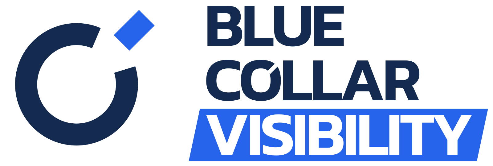




Give it space.
Keep text, borders, and other graphics outside this area. The downloaded artwork has a small export margin; add clear space in your layout.
Keep it legible.
- Primary lockup
- 240px / 50mm
- Visual mark
- 24px / 6mm
- Text mark
- 180px / 38mm
- Stacked lockup
- 180px / 38mm
- Horizontal lockup
- 420px / 90mm
Starting minimums for review. Inspect the open O and signal gap at final size; test embroidery, vinyl, and print with your supplier.
Keep the shape.
Use the supplied files at their original proportions. Use navy + blue on light surfaces, and white + blue or all-white on dark surfaces.
Skip the effects.
No stretching, rotation, shadows, extra outlines, added punctuation, or individually recolored words. Never put the blue signal on a blue background.
American roots.
A deeper palette.
Navy leads. Signal blue draws the eye. White is the base; neutral grays add structure. Use blue as a deliberate accent, not as the default text color.
Deep navy
Primary identity · headings · copy
RGB 20, 43, 79
Signal blue
Signal accent · calls to action
RGB 37, 99, 235
White
Base background · reversed identity
RGB 255, 255, 255
Light gray
Panels · alternate sections
RGB 243, 244, 246
Mid gray
Dividers · borders · quiet panels
RGB 209, 213, 219
Graphite
Secondary text · captions
RGB 75, 85, 99
Use contrast with intent.
Navy (14.1:1) and signal blue (5.17:1, AA for all text sizes) both support white text. Use navy body copy on white or light gray. Avoid blue on navy (2.7:1), navy on blue, and small text over patterns.
Colors are specified in sRGB. For physical materials, ask your printer to convert and proof against the intended stock; no universal CMYK or spot-color match is prescribed.
White / navy 14.1:1 White / blue 5.17:1 Navy / light gray 12.9:1
WCAG contrast ratios, rounded. These combinations meet AA for normal text.
Kanit. Confident, without shouting.
One family ties the identity together. Use weight and scale for hierarchy, with generous spacing in supporting copy.
Kanit Medium / 500
Good work
deserves to be seen.
Aa Bb Cc Dd Ee Ff Gg Hh Ii Jj Kk Ll Mm
0123456789 & ! ? @ #
0123456789 & ! ? @ #
| Role | Weight | Size / line height |
|---|---|---|
| Wordmark | 600 | Outlined master · equal-size words |
| Display | 500 | 48–80px / 1.0–1.1 |
| Section heading | 500 | 28–40px / 1.15 |
| Body | 400 | 16–18px / 1.5–1.6 |
| Labels | 500 | 12–14px / 1.4 |
Highlight with a skew.
Text highlights are always a solid signal-blue block skewed about 12°, with the words in white and upright: like this. Highlight one word or a short phrase per headline, on white or navy. Never straighten the block, use another color, or highlight body copy.
The logo uses −0.045em tracking and 0.88 line height before outlining. Don’t rebuild the wordmark by typing it. Use the downloadable paths. Fonts are self-hosted; the kit includes Kanit’s OFL license.
Stars and stripes.
A rhythm of our own.
A flag-inspired texture, not a literal flag. Staggered stars and paired stripes repeat seamlessly across covers, borders, and supporting panels.
192 × 144 tile · transparent SVG · repeat at a consistent scale
Download tile
Tonal only, so it stays in the background.
Navy at 9% for stars and 7% for stripes. Use on white or light gray, for covers, panels, and edge treatments. Use the vertical tile for tall formats like roll-ups, door panels, and phone screens. There is no full-color version: don't recolor the tile in navy and blue.
Keep content on solid ground.
Put the logo and reading text on a solid panel with its own clear space, even over the subtle tile. Repeat without stretching or rotating.
Real work.
Real people.
Photography carries much of what we say. Show actual tradespeople doing actual work: candid, well lit, and honest about the job.
Catch people mid-task.
Focused on the work, not posing for the camera. Real job sites, real homes, real gear.
Get close to the craft.
Close-ups of hands, tools, and materials show skill without needing a caption.
Show who it helps.
Tradespeople with customers, and the finished job. Natural moments, not handshakes for the lens.
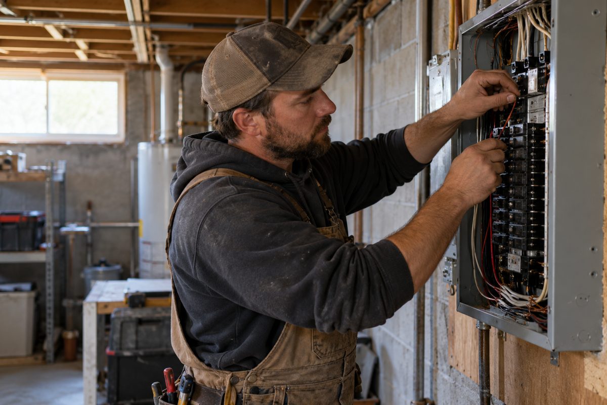





Example photos are AI-generated illustrations of the style, not real customers or jobs.
The symbol with photos.


Build more than a company, build a brand Super Intelligence knows.


The full logo is too detailed to sit on a sharp photo: keep it on a solid navy band or white panel, or on a photo softly blurred so the scene stays readable but the detail doesn't compete. Otherwise use the symbol alone, either as a mask filled with the photo or in white over a dark, calm area (add a soft navy gradient if the area needs it). Keep the full name nearby on the same piece.
Do
Natural light and true color. Worn workwear and everyday settings. Diverse crews. Leave calm areas in the frame for text. Use only the symbol on photos; keep the full logo on a solid panel.
Don't
Staged studio stock, spotless hard hats, thumbs-up grins, heavy filters, HDR, or vignettes. No AI images shown as real customers or jobs, and no competitor logos or unreadable safety violations in shot.
Use photos you have the rights to: our own shoots, or licensed stock such as Pexels or Unsplash. Get written consent from anyone recognizable, and credit the photographer where the license asks.
Mark the SI.
Keep the brand ours.
Some of what we offer is powered by SI (Super Intelligence), our name for AI. The sparkle tells people where that is, honestly and quietly. It labels a feature; it never stands in for our logo.
 Mixed / navy + blue, the default
 Mono navy / quiet, small sizes
 Mono blue / one accent per view White / dark surfaces
 Animated / while SI is working
 Animated mono navy
 Animated mono blue
 Animated mono white / dark surfaces
 Animated mono black
Use the animated sparkle only while SI is generating or thinking, then switch back to the still icon. It holds still for people who turn off motion, and it never loops on the logo or as decoration.
Pairing it up.
SI-assisted
Visibility Assistant
Ask the SI
Do
Use the sparkle only where SI does the work: a feature, a report, a button. Keep it next to a plain word like "SI-assisted". Keep it separate from the logo, with the logo's clear space between them.
Don't
Don't merge the sparkle into the logo or swap it for the Open sight symbol. Don't use it as decoration or on things a person made. Don't recolor it outside navy, blue, white, or black, or add glows and gradients.
Naming: say "SI" everywhere. Where people meet us for the first time (landing pages, ads, sign-up, onboarding), use the AI/SI combo, like "AI/SI-assisted", so newcomers recognize it. "Visibility Assistant" is a placeholder product name. Say what the SI does in plain words, and tell people when a person checks the result.
Speak like someone
who knows the work.
When you write for us, be direct, grounded, and confident. Respect the skill and effort behind each business. Explain what we do, who it helps, and what the next step looks like.
“Help the right customers find your business.”
Instead of “Unlock unparalleled market dominance.”
“Here’s what changed, and how we measured it.”
Use actual results. Don’t invent numbers, guarantees, or testimonials.
“Tell us about your business.”
Use an invitation people understand. Keep the tone human.
Sample copy shows tone only. Get our approval before publishing any claim about services or results.
Let the work take center stage.
Good work.
More visibility.
For businesses built on skill, service, and showing up.
Let’s get to work Build more than a company, build a brand Super Intelligence knows.
Dark surfaces / one-color white Small placements / a clear silhouette Examples only. The tonal pattern fades in behind the copy as quiet texture; the photo carries the message. When you use the symbol on its own, put the full name nearby.
Everything you need to start.
Transparent, outlined SVGs for scale. PNGs for everyday use. The kit contains primary, stacked, and horizontal lockups and text marks in navy + blue, navy, white, and black.
Download the complete brand kit Brand guidelines Editable Markdown Asset inventory Every SVG variant Tonal pattern Seamless SVG tile Tonal pattern, vertical Seamless SVG tile SI sparkle SVG · kit has every color + animated Color palette JSON Design tokens CSS variables Kanit license SIL Open Font License

SVG files contain vector paths, not live font text or embedded bitmaps. PNGs use transparent backgrounds. The white versions are intended for dark surfaces.